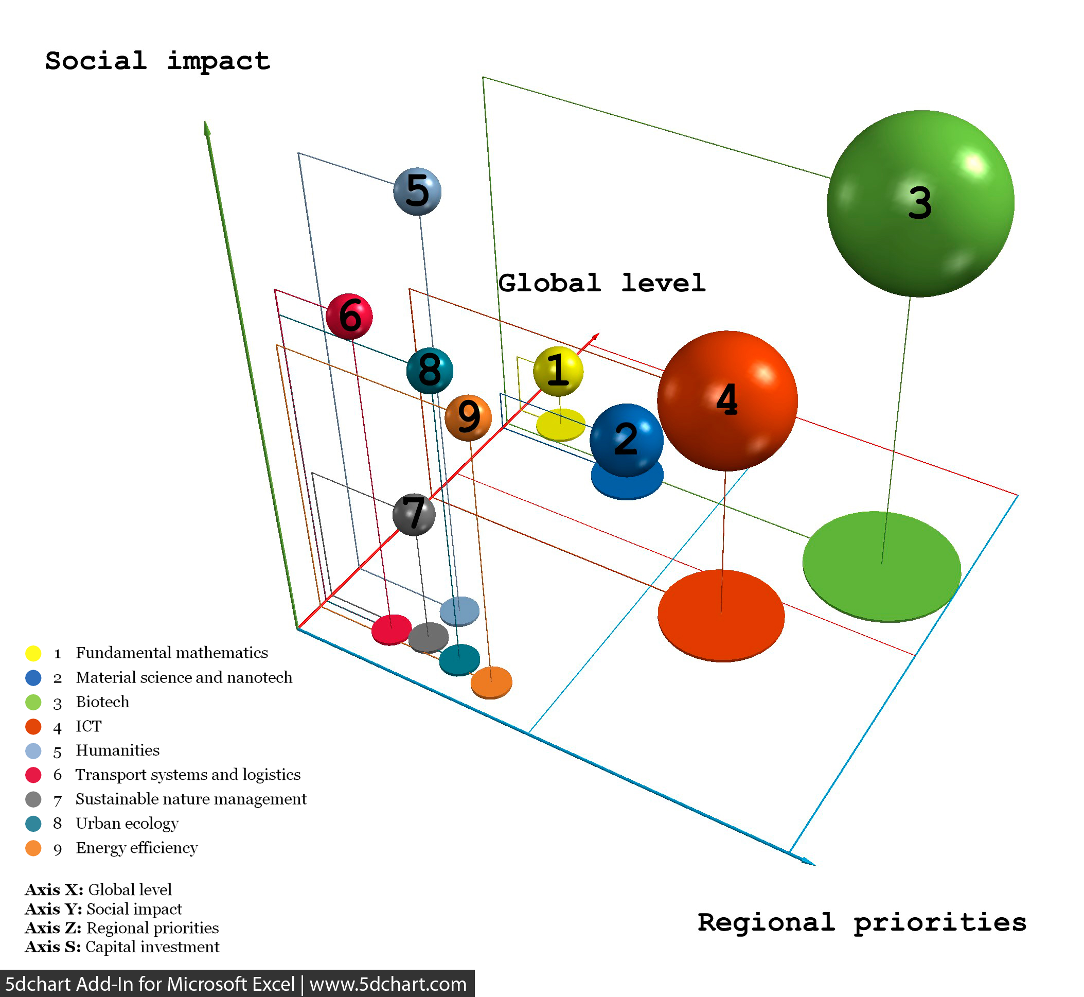

īubble charts are useful graphs for comparing the relationships between data objects in more than 2 numeric-data dimensions: the X-axis data, the Y-axis data, and the other data represented by the bubble size, color and shape.Īs will be highlighted in the next chapters, visual charting techniques in portfolio management projects (as bubble diagram) are employed in order to display balance and reach the right mix of projects in new product project portfolios. This means that pearls are always preferred and the white elephants always want to be avoided. Achieving the right number of projects for the limited resources available.įig.2 A Bubble Chart, on the x-axis is shown NPV and on the y-axis is shown the probability of success.Achieving a strategically aligned portfolio : also for this goal, the bubble chart results really useful.Balance choosing the right mix of projects : for this point, the use of bubble diagram and other visual tools is important in order to reach the best results.Maintain the competitive position of the business.Maximize the value of the portfolio for a given resource expenditure.To achieve this success, many different tools and methods are used.īelow the main goals settled by using portfolio management are listed and the importance of the bubble charts to reach few of them is highlighted : The emphasis of portfolio management is on ensuring that each project contributes to the overall organizational success. In this process, new projects are evaluated, selected and prioritized existing projects may be accelerated, killed or de-prioritized and resources are allocated and reallocated to active projects. īy contrast portfolio management is a dynamic decision process, whereby a business’s list of active new product (and development) projects is constantly updated and revised. Traditional project management is a process whereby each project is approved and managed independently focusing on the triple constraint (scope, time, cost) of the single project separate from other projects. Īt last the advantages and the disadvantages of this method will be analyzed and then will be discussed if actually can give a real help to the decision making in portfolio Management.įig.1 Triple constraint in a traditional project management: scope, time, cost additional project Different methods as the financial methods, strategic methods and scoring model.Brief description of other visual tools and differences from bubble chart.One example with the purpose of understand the importance of the method and the possible applications in a real case.Overall this article aspirates to perform an overview of the bubble diagram method and its uses through : Moreover different types of bubble diagrams using other parameters will be mentioned in the article. For this chart, four different categories will be analyzed : Pearls, Oysters, Bread & Butter and White Elephants. The most popular chart is the risk-reward which shows the probability of success on the vertical axis and the NPV ( Net Present Value) over a period of time on the horizontal axis. This method is widely used by the companies even if just a small percentage use it as the dominant. Furthermore the chart can usually be divided in four section to facilitate recognition of different situations. The diagram is a variant of the regular x-y plot, where circle or ellipse are used instead the single points, and extra information are provided by varying the shape, the size and the colour.

These visual representation is an adaptation of the four quadrant BCG (star cash cow dog wildcat) diagrams developed in 1970 by Bruce D. The bubble diagram or bubble chart (BC) is a graphing technique used in project portfolio management to making decision, especially to display balance in new product project portfolios.


 0 kommentar(er)
